Flexible Times: A Retro Display Typeface for Modern Web Design
In the crowded landscape of digital product creation, capturing a user's attention within the first few seconds is critical. As a UI designer working on high-conversion landing pages and brand-focused web experiences, I constantly search for typeface solutions that balance nostalgia with modern usability. This is where Flexible Times enters the conversation. It is not just another decorative asset; it is a strategic tool designed to elevate visual hierarchy and establish an immediate emotional connection with your audience.
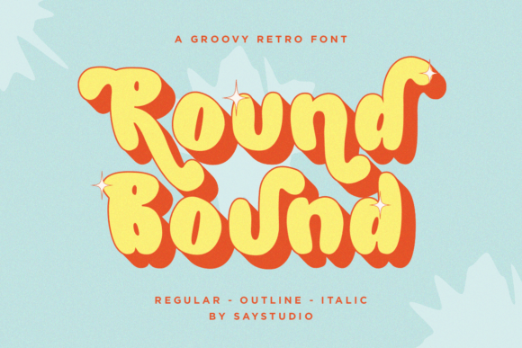
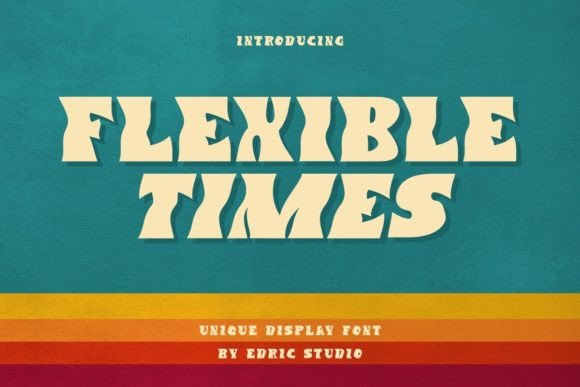
This retro display font features bold waves that create a dynamic, rhythmic presence. Whether you are designing a hero section for a SaaS startup or crafting a boutique online store banner, the unique character of Flexible Times allows your content to stand out without sacrificing readability. Its packaging includes two distinct styles, Regular and Italic, giving designers the flexibility to modulate tone and emphasis across different screen sizes and layout contexts.
Defining Visual Personality in Digital Spaces
When selecting a display font for a website, the goal is often to convey a specific brand tone instantly. Flexible Times brings a sense of warmth and approachability that many sterile, geometric sans serif fonts lack. The bold wave structure suggests movement and fluidity, which can subconsciously signal adaptability and creativity to your visitors. This makes it particularly effective for creative portfolios, coaching websites, and lifestyle brands that want to appear established yet fresh.
The font's personality shines brightest when used as a focal point. In a typical web layout, users scan content rather than reading every word. The distinctive curves of Flexible Times act as visual anchors, guiding the eye naturally through the page. By placing this typeface in headers or call-to-action areas, you break the monotony of standard typography and create a memorable brand identity. It transforms a generic webpage into a curated digital experience that feels intentional and crafted.
Ideally Suited for Hero Sections and Branding
For digital creators building conversion-focused layouts, the hero section is the most valuable real estate on a page. Here, Flexible Times excels at commanding attention. Imagine a landing page for a new course or a product launch; using the Regular style of this font for the main headline creates an inviting atmosphere that encourages users to stay. The bold waves provide enough weight to remain legible even against complex background images or gradients, provided the contrast is managed correctly.
Beyond the hero section, this font is excellent for logo design and social media graphics. The italic variant adds a layer of sophistication and flow, perfect for subheadings or taglines that need to complement a primary statement. When used in combination, the two styles create a cohesive rhythm that reinforces brand consistency. For instance, a fashion e-commerce site could use the Regular style for product titles and the Italic style for descriptive blurbs, creating a clear visual distinction that aids scanning behavior.
Optimizing Readability and User Engagement
While Flexible Times is a decorative display font, its application requires thoughtful consideration of context. In web design, we must ensure that aesthetic flair does not compromise accessibility or readability. Because of its bold and wavy nature, this typeface performs best for short phrases, headlines, and large text blocks rather than body copy. Using it for long paragraphs would reduce scanning speed and increase cognitive load for the reader.
On mobile screens, where space is limited, the impact of Flexible Times remains strong if scaled appropriately. Designers should test the font size carefully to ensure the wave details do not become pixelated or illegible on smaller devices. On dark backgrounds, the white or light variations of the font offer a striking contrast, while on light backgrounds, a darker shade provides a classic editorial feel. The key is to maintain sufficient spacing between letters (kerning) to prevent the waves from visually merging, which can happen in tight headings.
To maximize engagement, pair Flexible Times with a clean, neutral sans serif font for body text. This pairing strategy leverages the strengths of both typefaces: the display font captures attention, while the simple sans serif ensures comfortable reading for detailed information. This combination supports a logical visual hierarchy, allowing users to quickly grasp the message before diving deeper into the content. Such a balanced approach builds trust and professionalism, essential elements for any successful online business.
Practical Applications Across Digital Products
The versatility of Flexible Times extends across various digital touchpoints. For online store owners, it is an ideal choice for promotional banners and sale announcements. The retro vibe evokes a sense of timelessness, which can be particularly appealing for vintage clothing stores or artisanal goods. Similarly, for bloggers and content creators, using this font in blog headers or featured article titles adds a unique signature to their written work, distinguishing their voice in a sea of uniform typography.
Digital template creators and web developers will also find value in this commercial font. It works seamlessly in email marketing campaigns, where a splash of personality can improve open rates and click-throughs. When designing app screens or dashboard interfaces, using Flexible Times for feature highlights or welcome messages can humanize the interface, making the technology feel more accessible. The font's ability to convey emotion helps bridge the gap between cold data and warm user interaction.
Strategic Font Pairing and Technical Considerations
Successful web design relies heavily on harmonious font pairing. Since Flexible Times is a highly stylized serif font with a display character, it pairs exceptionally well with minimalist typefaces. A geometric sans serif like Helvetica Neue or a friendly rounded sans serif can provide the perfect counterbalance, ensuring the overall design remains clean and organized. Alternatively, for a more editorial digital identity, pairing it with a classic serif font can create a sophisticated, magazine-like aesthetic suitable for high-end brands.
From a technical standpoint, it is crucial to verify the file formats included in your license. Most modern projects require webfont versions (such as WOFF2) to ensure fast loading times and smooth rendering across all browsers. Checking for multilingual support is also advisable if your target audience spans multiple regions. Additionally, understanding the commercial licensing terms is vital for protecting your client projects. Ensure your license covers usage on websites, online stores, and digital templates, as these are common requirements for professional designers.
Ultimately, Flexible Times offers a compelling solution for designers seeking to inject personality into their digital products. By leveraging its retro appeal and bold wave structure, you can create web experiences that are not only visually stunning but also strategically aligned with your brand goals. Whether you are building a portfolio, launching a product, or refreshing an existing site, this creative font provides the tools needed to craft a lasting impression.
As you integrate Flexible Times into your workflow, remember that the best designs are those that serve the user first. Use this typeface to enhance clarity, guide navigation, and reinforce your brand story. With its dual styles and versatile applications, it stands ready to support your next big project, proving that a touch of nostalgia can drive modern digital success.